Jan 28, 2010
The Concept of Ad Space Hits a Pinnacle of Ridiculosity
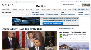
Checked out a story on the New York Times site. It looked like this:

I know you can see Ford’s prominently displayed banner, but you’ll also notice a wee-little banner up in the right-hand corner.
If you can’t really tell what it’s for, here’s a closer look (more or less actual size):

I don’t know how much the distributors of The Imaginarium of Doctor Parnassus paid for that (it was undoubtedly part of a package deal), and maybe a banner ad that obscure gets some clicks (can anyone out there provide stats on the effectiveness of something like this?), but I can’t help seeing the decision to sell that tiny bit of white space, let alone the willingness to buy it, as an act of desperation and a harbinger of worse to come.
given that banner’s proximity to the search box, my guess is NYT has some numbers on folks who come to the site for research purposes rather than merely reading the headlines.
That’s a good point, Edward. The real estate, such as it is, next to the search box will have some value.
[…] This post was mentioned on Twitter by Marcy (:, Matthew T. Grant. Matthew T. Grant said: The Concept of Ad Space Hits a Pinnacle of Ridiculosity http://bit.ly/9A9J9K […]